Save Changes Integrated 3
2007-05-20 6 Comments
Previously:
Save Changes Integrated 1
Save Changes Integrated 2
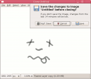
Due to the various concerns that have been raised, here’s another approach, targeted at the WM alone.
I also played a bit with WM button styles and suddenly had the idea of using a colour change on the close button instead of a * in the document window title to indicate unsaved changes. But as that doesn’t show up in task bar items, perhaps both should be used.
The warning colour of the button could extent to the titlebar that serves for both document window and dialog. The window title changes to that of the dialog, as that makes more sense in the task bar, I think.
The dialog is meant to be a movable relative to the document window , just in case the user wants a free view on the canvas, but is placed so as to emphasize the connection. It’s taken right from GIMP; the wording, icon and button labels shall be of no concern, here.


Hello
I’m not sure to see the advantages of such a dialog over the standard Gimp dialog. Previously, your main concern seemed to be the fact that the dialog covered a part of the image, and here it still covers a part of the image (and I think the behaviors could be very different from one WM to another).
The colored close button could be a nice touch (as long as the * in the window title is kept), but the same ‘different behaviour depending on the WM’ problem may appears.
(e.g. I use Gimp with Ion3, so there’s no little close buttons on top of the image.)
Rore: Yes. I have been told that resizing the window is tricky or could even be impossible depending on the WM.
Before I thought the application could take care of embedding the dialog part, but this version here is purely a WM thing.
And … bing! You’ve just reinvented Mac OS X’s “sheets”. I wondered if that might happen. 🙂
I dislike sheets because, every so often, the input I want to provide in them depends on something in the parent window, and I can’t see that something because it’s obscured by the sheet, and I can’t move it out of the way. To continue my example from the previous post, imagine here that you had a very small window for editing an icon, and the save-changes alert completely covered the icon, so you couldn’t tell whether you wanted to save it or not. I’d much rather just have dialogs move when I move their parent window, while still being able to move dialogs independently of their parent window.
As for disabling the close button, all non-draggable controls in a window (except the minimize button) should be disabled when that window has a dialog open. Window managers could easily be smart enough to do that for title bar buttons, at least. Getting toolkits to follow suit for the window contents would require more work.
mpt: this “sheet” is meant to be draggable. I would still advocate window resizing to provide the best possible layout, but like I said, I have been told that resizing windows is hard to impossible depending on WM.
From the screenshot, I don’t see which part of the alert is supposed to be draggable. Is it “any part that’s not already a control”? If so, that’s a great idea, but it shouldn’t apply only to alerts. 🙂
mpt: Yes, any part that’s not an active area already. A mouse cursor change could improve the discoverability. I wouldn’t mind to see it applied everywhere. For those no-distinct titlebar themes, being able to drag the window on empty menu / toolbar space is a must, anyway.