Giraffe, Tortoise? Girtoise!

Two Girtoises about to feast on cloud-rooted Bananeries on the plains of the seastern continent. These animals are also known as Toraffes or by their scientific name: Giradinoides. In German, they have the even better name Schiraffen. The Bananeries contain valuable vitamins and minerals which help the animals in maintaining smooth fur and strong shells.

Detail at full resolution:

Available printed on apparel, as poster and a few other forms.

Technical notes

This is a completely tablet-drawn work. With my trusty serial Wacom Intuos, still working as I keep compiling the module after every kernel update. Originally, I wanted to use Krita for the nice paintbrush engine and the canvas rotation. I found the later to be critical in achieving the smoothest curves, which is a lot easier in a horizontal direction. With what ended up being a 10000 x 10200 resolution and only 4 GiB RAM, I ran into performance problems. Where Krita failed, GIMP still worked, though I had to switch to the development version to have canvas rotation. At the end, GIMP’s PNG export failed due to it not being able to fork a process with no memory left! Flattening the few layers to save memory led to GIMP being killed. Luckily, there’s the package xcftools with xcf2png, so I could get my final PNGs via command line!

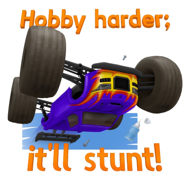
“Hobby harder; it’ll stunt!” RC-car T-shirt design

Backstory

In 2016, RC-car company Arrma released the Outcast, calling it a stunt truck. That label lead to some joking around in the UltimateRC forum. One member had trouble getting his Outcast to stunt. Utrak said “The stunt car didn’t stunt do hobby to it, it’ll stunt “. frystomer went: “If it still doesn’t stunt, hobby harder.” and finally stewwdog was like: “I now want a shirt that reads ‘Hobby harder, it’ll stunt’.” He wasn’t alone, so I created a first, very rough sketch.

Process

After a positive response, I decided to make it look like more of a stunt in another sketch:

Meanwhile, talk went to onesies and related practical considerations. Pink was also mentioned, thus I suddenly found myself confronted with a mental image that I just had to get out:

To find the right alignment and perspective, I created a Blender scene with just the text and boxes and cylinders to represent the car. The result served as template for drawing the actual image in Krita, using my trusty Wacom Intuos tablet.

Result

hobby_harder_121_on_white_1024x0958

This design is now available for print on T-shirts, other apparel, stickers and a few other things, via Redbubble.

New Ardour Logo

Ardour is an application for recording, editing and mixing music. It is licensed under the terms of the GPL 2.

The upcoming 3.0 release seemed like a good opportunity to take another look at the logo I designed in 2006. A selection of drafts from back then, ending with the final design:
ardour_process_old

I had to ask myself: Is this logo (still) appropriate for Ardour?

The upcoming 3.0 release will be a digital audio and MIDI production application, available for Linux and Mac OS X. It is designed for frequent and prolonged use, being able to deal with huge amounts of material, complex signal pathways, precise and intense editing. Reliability, correctness and precision are of utmost importance.

The logo should take a matching stance, be sharp and have a strong presence. I think the old version does a fine job in this regard. It also happens to be well established and liked by the community (of course not by everyone). Back then I decided to use a free-form wave shape, less stylized, more realistic. Now I think a shape with even subdivisions will make the logo appear more precise.

I worked my way through variations of the curves that describe top and bottom of the wave, the number of teeth, their shape, relative height of the type and its consequences on letter spacing:

ardour_process_new
PDF of above image, in case you’d like to take a closer look.

ardour_logo_old_and_new

Application icons, first column are the old ones. I reduced the number of teeth for the smaller versions, keeping them at least 1 pixel wide.
ardour_app-icons

The new logo is already in use on the new website that went online about a week ago. I helped a bit with color selection, made a few suggestion and provided 3 icons:
record-edit-mix

Music: Gleshnor

Sugar-coated electronic rasp.

This project started as a test of Ardour 3’s new MIDI and synth-plugin features (still in beta). In this role, it served in uncovering and fixing a number of issues and grew into something a little more ambitious over time.

The kick, bass and lead all come from instances of Calf‘s Monosynth.

When thinking about what I could draw as a cover image, Driddee jumped into my mind. Similar to the music, creating this image was a test run, with Krita. Took a bit to get comfortable with it, but now I’m rather pleased. I need more practice, obviously 🙂

Other formats, the entire Ardour session as well as a track-by-track export (wavpack format) are available via archive.org.

Creative Commons License
Gleshnor and Driddee by Thorsten Wilms are licensed under a Creative Commons Attribution-ShareAlike 3.0 Unported License.


Flattr this

Get on Board the Blues – Guicussion Remix

Dave Phillips recently published a great Blues track in a not so great mix and made the material available on request. Since others covered the gentle just bring out what’s there (by Fons Adriaensen) as well as tasteful addition of drums (by Jason Jones), I just had to do something a little different.

Online player, choice of different formats and the entire Ardour session packed up on archive.org.

All additions are created from the original material, no samples added. Both the original and remix have been produced with pre-release builds of what will become Ardour 3.0.

Lyrics

More music from Dave
More music from yours truly

Switches in Unity menus

Plans for the next iteration of the network status menu in Unity include the use of switch widgets.

As has been brought up on the unity-design list, their placement on the right is likely to make the issue of diagonal movement often opening adjacent menus worse. Independent of improving the menu mechanics, enabling/disabling could be handled differently in style and placement of the widgets.

I think the adoption of light-switch style widgets in point-and-click interfaces is a mistake. Their look implies a sliding movement, not just a click. They are unclear about whether the labels refer to the current state, or the state to change to (only the use of bright coloration for the On state helps here, but does nothing, if all you see is an Off).

If all you have to communicate is On/Off, what is wrong with checkboxes? They do have unclear target areas (in proper implementations, the label is clickable, too), but are well established and do not suffer from the problems switches have, as listed above.

In the middle: a different take on the switch widget, trying to do without separate label and state-labels. The state that can be switched to is represented by a button, while the current state is flat, as it is not clickable.

Finally an experiment, to see whether a strike-through approach could work for a very compact solution. It is hard to find a balance between legibility of the label and making the stroke clear.