New Ardour Logo

Ardour is an application for recording, editing and mixing music. It is licensed under the terms of the GPL 2.

The upcoming 3.0 release seemed like a good opportunity to take another look at the logo I designed in 2006. A selection of drafts from back then, ending with the final design:
ardour_process_old

I had to ask myself: Is this logo (still) appropriate for Ardour?

The upcoming 3.0 release will be a digital audio and MIDI production application, available for Linux and Mac OS X. It is designed for frequent and prolonged use, being able to deal with huge amounts of material, complex signal pathways, precise and intense editing. Reliability, correctness and precision are of utmost importance.

The logo should take a matching stance, be sharp and have a strong presence. I think the old version does a fine job in this regard. It also happens to be well established and liked by the community (of course not by everyone). Back then I decided to use a free-form wave shape, less stylized, more realistic. Now I think a shape with even subdivisions will make the logo appear more precise.

I worked my way through variations of the curves that describe top and bottom of the wave, the number of teeth, their shape, relative height of the type and its consequences on letter spacing:

ardour_process_new
PDF of above image, in case you’d like to take a closer look.

ardour_logo_old_and_new

Application icons, first column are the old ones. I reduced the number of teeth for the smaller versions, keeping them at least 1 pixel wide.
ardour_app-icons

The new logo is already in use on the new website that went online about a week ago. I helped a bit with color selection, made a few suggestion and provided 3 icons:
record-edit-mix

ardour.org has a new theme

It was decided to switch to a ready-made theme with the switch to Drupal 6 to ease migration in the future. So there was nothing to do for me, except provide a matching rendition of the Ardour logo 🙂

head

See it and a white version for the front page at ardour.org

Ardour Button

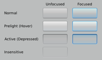
Seems like several Ardour developers like the new Pro Tools 8 look, especially the buttons. I have been asked to mimic them in SVG. Took a little freedom, as I don’t think plain copying is a good idea.

ardour_button

The focused variants would only be needed for dialogs.

Ardour Track Resize

The ongoing development branch of Ardour supports vertical resizing of tracks/busses via dragging (instead of the prior menu/steps approach). Currently there just a small gray rectangle in the bottom left corner of each track/bus. Paul asked me to create an icon. Not many options there, but i think a relief like used elsewhere to denote draggability is better.

The same without the broken 3d button borders on the track/bus headers:

Work on Ardour export started

It has been a while since I wrote that document about a better export dialog for Ardour.

Now Sakari Bergen takes part in this years Finnish Summercode project, improving export functionality based on my work and adding meta data support. It feels great to have a competent programmer realize my concepts (especially compared to struggling along to get just a tiny demo implemented myself … ;)). I’m looking forward to the results. We have been chatting on IRC and I’m ready to assist him where I can.

Ardour MIME Type Icons 2

Paul picked the right side of the previous set. The final icons, only slightly touched-up (separate files, ready for use):

application-x-ardour_48px.png application-x-ardour_32px.png application-x-ardour_22px.png application-x-ardour_16px.png

Soon in a SVN repository near you.